Tuesday, 30 September 2008

Andy Gilmore


I found a fantastic website called Formfiftyfive
and I came across Andy Gilmores work which I really like his patterns and colours he uses very mesersing but I came across some intersting comments.


I can see the simaritys but he has it his work his own.

Mc Donalds

If you are like me who hates mc donalds but really like there ads appart from the Justine Timberlake ad 'Im loving it'.Sort of an love hate relationship.


Advertising Agency: DDB, Sydney, Australia

I Beer

Printing techniques

This couple of days we've been learning different print techniques what works appropriatly from either mass production or one of pieces.
also been learning from the difference between RGB and CMYK.Here's a few of my notes and information that I put it in my sketch book. I found the typography from my non format book that I just bought.they already created I love RGB and CMYK so i did my own as well to go with all types of printing.


Thursday, 25 September 2008

first brief of second year

From our collection during the summer collecting contrasting colours typography or image. Taxonomy.
We had to pick a Pacific image from everything that we found during the summer andsum up a pattern or message from our collection.
When i i was put into groups it was obvious that what i did was about coins.As a group we came up with ideas like 'object of desire', or 'more money more problems'. There were good ideas but i thought I could come up with something better that is relevant to the summer brief.
I came up with idea about the price getting increasingly high food, petrol, gas and electric. Also major bank company's going bankrupt and air plain company's.
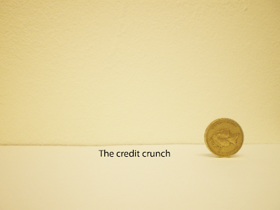
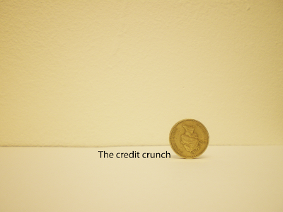
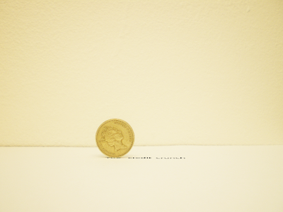
I used the word 'The credit crunch' because its now the most used word in the nation during the past few months. The pound coin was a a perfect icon of using the meaning of money but also showing the queens face pins points the money issue in Britain.
I used helevetica for my typography and used the icon to 'crush' the credit crunch typography. I took the photo simply by using to sheets of paper one on the table and other on the wall. The sequence works well its just a shame that the computer that i was using would let me open adobe illustrator so i could manly change the typography while it was getting crunch but i manage with photoshop. Apart from that this is my first quick brief since June so I'm a bit chuffed.



Tuesday, 23 September 2008

Its like a touch boom box i pod.
Its called a "Reactable",round table that is used from different object to create beats and sounds.

Using logos and typgraphy on music videos

This by Justice a fantastic band and they make fantastic videos.


Tuesday, 16 September 2008

Tuesday, 9 September 2008

Copper Rubbing

They are still the same coins but I copper rubbed them and put them in oder of years.
I put in order of date and size place and size.


Monday, 1 September 2008

Summer

collecting coins

One of my best friends lent me her coin collecting which she was given bye a friend of a family.I had a good study of these coins which where all round the world from Africa to Asia some where roman and victorian coins.I thought this was a perfect chance to this project.
These are the once I have choosen cos there why so many i couldnt do all them!